
One of my Raspberry Pi lies on the floor of my living room and, besides other tasks, it has a few sensors attached to it that measure room temperature. The house is heated via a central ventilation system, where the furnace is controlled by a thermostat that is set to 19°C. So I didn’t expect anything interesting when I, a few months after setting it up, looked at the recorded temperatures:

Indeed, nothing too remarkable. It has been holding 19°C as it should (was set to 18°C in March), and on a few sunny days in mid April the temperature went up notably. However, things get more interesting if we zoom in:
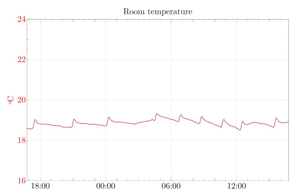
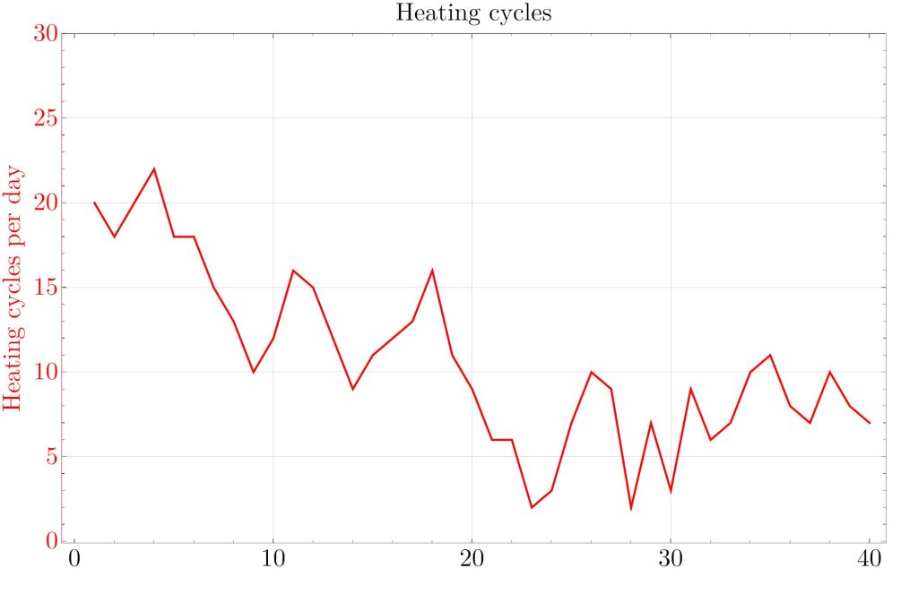
Throughout the day, there are several tiny spikes. At these times, the furnace is switched on. You usually don’t notice this when you are in the room, but the sensors do. If we plot the rate of change of the room temperature, these events show up as distinct spikes where the temperature increases abruptly:

From this data series, it is easy to detect when the furnace has been activated. We pick some threshold, say 0.04°C/10min, and count how often on each day the rate of change has crossed this threshold. This gives us the number of heating cycles per day:
Now the intuition is that the house needs more heating when it is cold outside. So we would expect the amount of heating to be roughly proportional to 19°C – outside temperature , where we take the daily average temperature for outside. We get this plot:
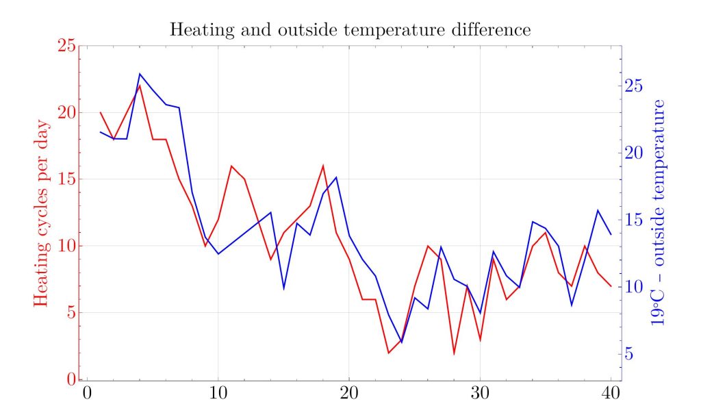
It is remarkable just how closely these curves match. It was by no means clear that the number of heating cycles really measures the amount of heat used per day, because the cycles could have been differently long. But they aren’t.
One could probably obtain an even better correspondence between these curves by tweaking the counting algorithm, e.g. the threshold or minimum duration for a heating cycle. But that is of limited interest because I could just put one of the sensors outside if I wanted the outside temperature. What’s more interesting is the opposite direction: What if I didn’t knew that I live in Waterloo? Let’s compare our time series of heating cycles in the past 40 days with the daily average temperatures of places around the world. For each of them, we compute a correlation coefficient, which is between 1.0 (if the data series are the same) and -1.0 (if they move exactly in reverse). We find a plot like this:
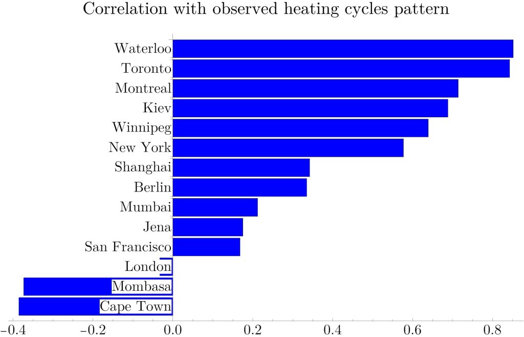
Indeed, of all the cities we compared, it identified Waterloo as the most fitting one. It is unsurprising that Toronto is similarly good, given that it is close by. Of course, if we were to compare with every single city in the world, we would probably find one where the correlation is even higher, due to random fluctuations. On the other hand, or algorithm to detect heating cycles was pretty naive, and we only used 40 days of data. Moreover, we didn’t use humidity (which would probably tell if it rained that day). If we had access to room temperature and humidity from several months, we would probably be able to to determine exactly in which city the sensor is installed.
Scientifically, this is a curious observation and it proves the accuracy of even these cheap temperature sensors just lying randomly on the ground. However, it also serves as a warning that even something as innocent as a room temperature data series can leak sensitive private information.